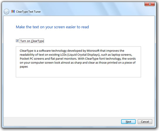
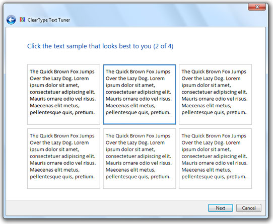
Everyone has a different idea of good font smoothing. What is nice and smooth to you may be blurry to someone else. That is why Microsoft included the ClearType Text Tuner in Windows 7.
Start the ClearType Text Tuner by clicking on the Start Button and typing in cttune and then hit Enter.
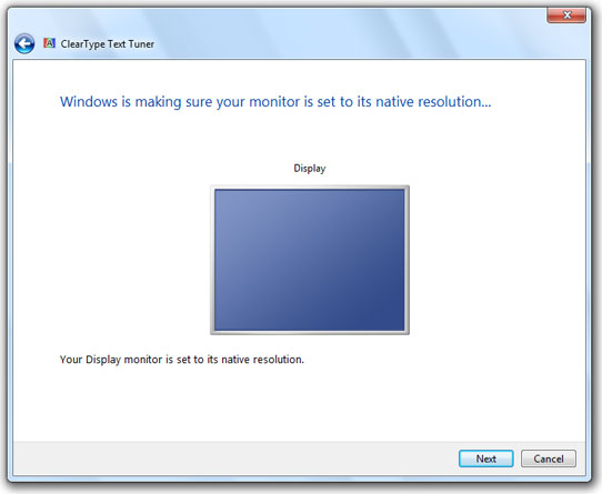
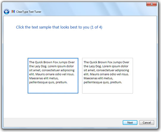
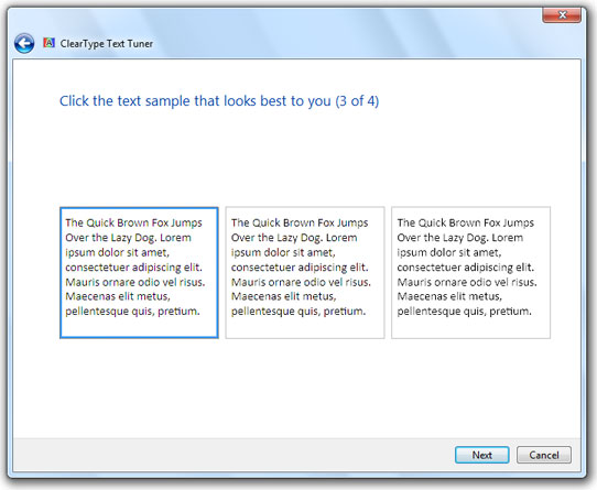
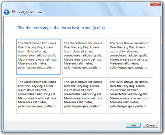
Then just follow the wizard and select the options that look best to you on your LCD monitor.
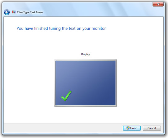
Click Finish to save your changes.

Microsoft Edge on Windows 10 includes the Windows Defender SmartScreen service for years that prevents users from accidentally browsing to known malicious and fake phishing websites. While Microsoft Edge is a great browser and has many very strong security features, Microsoft understands that many people choose to use Google Chrome. As such, Microsoft still cares about the security of the web browser...
Read More
It happens every few months. My operating system drive runs out of space, and I must begin the hunt for things to delete or move to another drive. As a first step using a cleanup utility such as CCleaner is helpful, but it only finds the easy targets such as temporary files. Unfortunately, deleting these files does not typically...
Read More
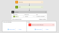
Shopping for a hard to find item on Amazon.com that is always sold out? I was recently on the hunt for an external GPU enclosure that would show up in small quantities on Amazon. After failing to snag one by randomly checking periodically, I figured there must be a better way. Microsoft Flow to the rescue!
Read More

If you own a Google Chromecast streaming device, you can easily share a browser tab in Chrome browser or even your entire desktop. This can be very useful when presenting from your laptop or if you just want to watch something on a big screen that is only on your PC. The only requirement is you must be on the same network as your Chromecast...
Read More